What is a color palette and why is it important for website design?
When designing a website, one of the most important elements to consider is the color palette. A well-chosen color scheme can make a website more attractive, engaging, and memorable to users. However, with so many options available, it can be challenging to select the best color palette for your website.
One of the first steps in choosing a color palette for website design is to consider the purpose of the site. For example, if it's a professional site, a neutral color palette for the website might be the best choice. On the other hand, if it's a creative site, you may want to experiment with a more vibrant color scheme.
Set the tone for your website
There are many color palette ideas for a website to choose from. One way to start is by exploring some of the best options available online, with inspiration to create website color palettes that work well together.
Another approach is to use a tool to help you create a color palette. With our free color palette generator, you can browse thousands of recommendations to get inspiration for your website.
Make a visual statement
When choosing a color palette for a website, it's essential to consider not only the colors themselves but also how they interact with each other. A well-designed color scheme should have a balance between the different hues, tints, and shades used.
Additionally, it's important to keep in mind that different colors can evoke different emotions and meanings, so it's essential to choose colors that align with your website or the message you want to convey.
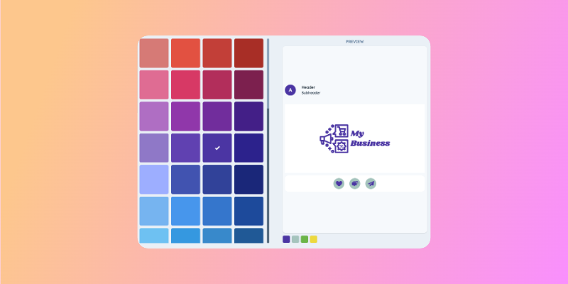
How to use our website color palette generator
1. Pick your primary color in the color palette maker
The primary color is the color that most represents your website. It will be the foundation for the rest of your color scheme.
2. Choose your complementary colors
After you’ve chosen a primary color, our color picker automatically suggests three complementary colors for your website. You can continue generating different color combinations until you have a scheme that creates the visual effect you want.
Choosing different shades of the same color creates a calm and harmonious feeling. However, if you want to generate more excitement, you can use contrast by choosing colors opposite one another on the color wheel (such as blue and orange).
3. Choose a color scheme from the generator
Our color scheme generator will provide several full-color palette options that add neutral tones to your chosen primary and complementary colors. Choose the best color palette for your website based on the visual impression and feelings generated by the colors.
4. Customize your color palette for website
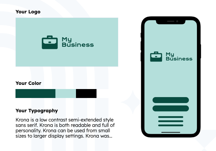
Customize your palette by editing any colors generated by the color palette creator until it is a perfect fit for your site. Once you’ve selected your color palette, it will automatically be applied to the logo you created in the brand kit generator.
You’ll also get hex codes and swatches for each color so you can add them to a brand identity book and use them in templates and designs.