
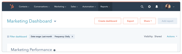
“The nav” plays a big part in shaping what it is actually like to use HubSpot’s products. A well designed nav helps customers easily get from place to place, but also needs to reflect the mental model we want to convey about our products.
If you are a long time partner, you have grown alongside of us as our products have shifted their shape. We introduced a name change to unify our free products in January to begin this transition. We’ve found ways to solve for different combinations of tools our customers needed access to, but truthfully, hadn’t rethought the navigation from scratch, until now.
Starting today, we will begin introducing the new navigation to partner portals, rolling it out by tier through the end of April. We’re giving partners opt-in access first so you have time to get used to it before it’s live in all client portals on April 30.
The new navigation menu will help you:
Work faster. No more switching between screens to find the tools that you need. Everything in the new navigation is now clearly visible and easy to find.
Get more done. The tools you’re most likely to use are at the top of each section. Because a second saved here and there really adds up over the course of your day.
How will it work?
You’ll soon see an option in HubSpot prompting you to get started with your new navigation. This will allow you to opt-in your portal, on your own timeline. You can switch back and forth between the old and new for awhile, but eventually the move to the new navigation will be permanent. We’ll let you know before that happens, too.
One thing to note - when you choose to opt-in, you’ll be opting in your entire portal (this is *not* something that happens on a per-user basis). But don’t worry, we’ll notify the rest of your team the first time they see the new navigation, and also let them know who on your team initiated the change-over.